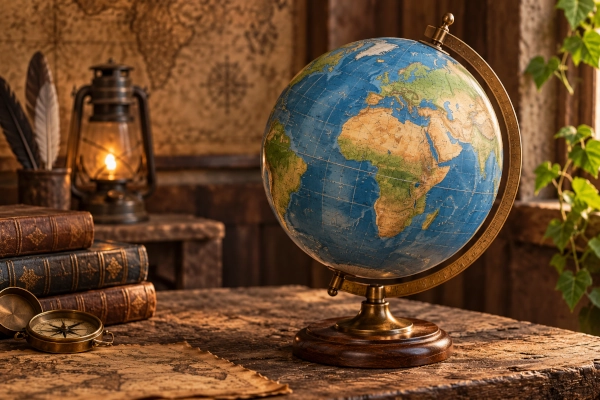
Every flat world map is distorted.
The Earth is approximately spherical, while a conventional map is two-dimensional. Turning the curved surface of the planet into a flat sheet therefore requires stretching, compressing or cutting parts of the globe. Cartographers use mathematical systems known as map projections to manage these distortions.
Different projections preserve different geographical properties. Some maintain local shape, others preserve area, distance or direction, while several attempt to strike a visual balance between competing distortions. This means there is no single map projection that is objectively best for every purpose.
A projection suitable for navigating a ship may be unsuitable for comparing the size of Africa and Greenland. A projection useful for showing global population may distort the shapes of individual countries. Choosing the right map therefore depends on what the map is intended to communicate.
Why Every Flat Map Distorts the Earth
Imagine cutting the skin from an orange and trying to flatten it onto a table without tearing, stretching or overlapping it. It cannot be done perfectly. The same geometric problem applies to the Earth.
When the globe is projected onto a flat surface, at least one geographic property must be distorted. Cartographers therefore decide which characteristics are most important for a particular application.
The four properties most commonly considered are area, shape, distance and direction. A map can preserve some of these accurately, but no flat projection can preserve all of them simultaneously across the entire planet.
This is why different maps of the same world can look surprisingly different even though all are based on the same geography.
Cylindrical Projections
Cylindrical projections imagine the Earth projected onto a cylinder wrapped around the globe. When the cylinder is opened, the result is usually a rectangular map.
These projections are among the most familiar because they are easy to display on books, screens and navigation charts. Distortion generally increases toward the poles.
The best-known example is the Mercator projection.
Mercator Projection
The Mercator projection was developed by Flemish cartographer Gerardus Mercator in 1569. It became extremely important for marine navigation because it preserves local angles and directions.
On a Mercator map, a constant compass bearing can be represented as a straight line. This made it exceptionally useful for sailors navigating across oceans.
Its main weakness is severe distortion of area at high latitudes. Greenland, Canada, northern Europe and Russia appear much larger than they actually are relative to countries and continents closer to the equator.
Africa, for example, is around fourteen times larger than Greenland in actual area, but the two can appear surprisingly similar on a Mercator world map.
A classic real-world example is a traditional marine navigation chart, where a ship captain can plot a constant compass bearing as a straight line.
The Mercator projection is therefore highly useful for navigation, but it is a poor choice when the objective is to compare the true sizes of countries and continents.
Web Mercator Projection
A modern variant known as Web Mercator is widely used by online mapping systems.
It became popular because rectangular map tiles can be divided, stored and displayed efficiently at different zoom levels. It also preserves local shapes reasonably well when users are looking at cities, streets and relatively small regions.
A familiar example is the type of projection used in interactive online street maps, where users zoom from a world view down to individual roads and neighbourhoods.
Its advantage is speed, consistency and ease of digital display. Its disadvantage is that, when viewed at global scale, the same area distortions associated with Mercator become obvious, with high-latitude regions appearing much larger than they really are.
Gall-Peters Projection
The Gall-Peters projection is a cylindrical equal-area projection. It became widely known because it preserves the correct relative area of countries and continents.
Africa, South America, India and other regions near the equator therefore appear much closer to their actual proportional size than they do on Mercator maps.
Its main advantage is geographical area accuracy. This makes it useful for maps showing population, agriculture, forests, economic output or any other information where the size of geographic regions matters.
A common example is an educational or development-oriented world map designed to show countries and continents in their correct relative areas.
The disadvantage is shape distortion. Countries near the equator can appear vertically stretched, while areas closer to the poles may appear compressed.
Gall-Peters demonstrates one of the fundamental compromises of cartography: correcting area does not automatically produce natural-looking shapes.
Equal Earth Projection
The Equal Earth projection, introduced in 2018, is an equal-area projection designed to combine accurate representation of land area with a visually familiar appearance.
It preserves the relative area of continents while avoiding some of the extreme shape distortion found in older equal-area projections.
Africa therefore appears substantially larger than on Mercator maps, while northern regions no longer dominate the visual composition of the world.
Its main advantage is that it combines true relative area with a relatively balanced visual appearance. This makes it particularly useful for educational maps, thematic maps and global comparisons.
A good example would be a classroom or thematic world map showing population, forest cover or development indicators, where the visual size of each region should correspond to its real land area.
Its disadvantage is that shapes, distances and directions are still distorted to some extent. Equal Earth is not intended for navigation and does not preserve every geographical property.
It represents a good example of a modern projection designed primarily for communication and education rather than navigation.
Robinson Projection
The Robinson projection was developed in the 1960s by American cartographer Arthur H. Robinson. Instead of attempting to preserve one property perfectly, it tries to create a visually balanced representation of the whole world.
For many years, the National Geographic Society used Robinson for its world maps.
Its greatest advantage is readability. It produces a world map that looks natural to many viewers and avoids the extreme polar enlargement of Mercator.
A well-known real-world example is a general-purpose atlas or wall map, especially the kind historically used by National Geographic.
Its disadvantage is that it preserves neither area, shape, distance nor direction perfectly.
Robinson is known as a compromise projection because its purpose is to reduce overall distortion rather than eliminate one particular type.
Winkel Tripel Projection
The Winkel Tripel projection is another important compromise projection. It attempts to minimise three types of distortion simultaneously: area, direction and distance.
The word Tripel refers to this three-part compromise.
The National Geographic Society adopted Winkel Tripel for many of its world maps after moving away from Robinson.
Its main advantage is that the overall shape of continents remains relatively familiar while extreme distortion is reduced. It is therefore well suited to general-purpose world maps.
A clear example is a modern general-reference world map, especially one intended for atlases and educational use where a balanced appearance matters more than preserving a single property exactly.
Its disadvantage is that none of the major geographical properties is preserved perfectly.
For educational atlases and general reference maps, however, this balanced approach can be more useful than mathematically perfect preservation of one characteristic.
Mollweide Projection
The Mollweide projection is an equal-area projection with a distinctive elliptical outline.
It accurately preserves relative land area, making it useful for displaying global patterns such as population density, rainfall, climate zones, vegetation, emissions and biodiversity.
Africa and South America appear in appropriate proportion relative to northern continents.
A common example is a global climate or environmental map, such as one showing rainfall, temperature anomalies, biodiversity or carbon emissions.
Its main advantage is accurate area representation across the entire world.
The disadvantage is that shapes become increasingly distorted away from the central meridian and toward the outer edges of the map. Continents near the edges can appear noticeably stretched.
Because of this, Mollweide is often used for thematic scientific maps rather than ordinary political maps.
Goode Homolosine Projection
The Goode Homolosine projection is unusual because the world appears divided into several interrupted sections.
It combines elements of the Mollweide and sinusoidal projections to preserve area while reducing distortion across major landmasses.
The breaks are normally placed through oceans so that continents can be shown with relatively little distortion.
A classic example is a global land-use, vegetation or agricultural map, where preserving the shape and area of continents is more important than showing uninterrupted oceans.
Its major advantage is excellent representation of continental area and shape.
Its disadvantage is immediately visible: the oceans are broken apart.
This makes the projection unsuitable for showing ocean routes, global connectivity or relationships that cross the interrupted sections.
Azimuthal Projections
Azimuthal projections represent the Earth as though its surface were projected onto a flat plane touching the globe at one point.
They are often used for maps centred on the North Pole, South Pole or a particular city or region.
Distortion generally increases farther from the centre.
One important advantage is that certain azimuthal projections can accurately show direction or distance from the central point.
This makes them useful for aviation, radio communication, polar mapping and understanding routes from a particular location.
Azimuthal Equidistant Projection
The Azimuthal Equidistant projection preserves accurate distance from the centre of the map to other points.
If the map is centred on Delhi, for example, distances from Delhi to other locations can be shown correctly along radial lines.
A famous example is the world map used in the United Nations emblem, which is based on an azimuthal projection centred near the North Pole.
Another practical example would be a map showing distances or communication reach from New Delhi to major world cities.
Its advantage is accurate radial distance from the centre.
Its disadvantage is substantial distortion toward the outer edges. Shapes and areas can become increasingly inaccurate as distance from the centre increases.
Orthographic Projection
The Orthographic projection shows the Earth as it would approximately appear from space.
Only one hemisphere is visible at a time, producing a realistic globe-like appearance.
A familiar example is a satellite-style image of Earth showing one hemisphere, such as views centred on Asia, the Atlantic or the Pacific.
Its greatest advantage is visual familiarity. It is excellent for illustrations showing weather systems, hemispheres, Earth observation or the planet as a whole.
Its disadvantage is that it is not particularly useful for precise measurement. Area, distance and shape become increasingly distorted toward the edges.
It is therefore more useful for visualisation than for technical cartography.
Conic Projections
Conic projections imagine the Earth’s surface projected onto a cone placed over part of the globe.
They work particularly well for countries and continents extending mainly from east to west in the middle latitudes.
Because distortion can be kept relatively low across selected latitude bands, conic projections are widely used for national and regional maps.
Lambert Conformal Conic Projection
The Lambert Conformal Conic projection preserves local angles and shapes particularly well.
It is commonly used for aviation charts, weather maps and mapping large regions in the middle latitudes.
A real-world example is an aeronautical navigation chart covering a wide east-west region, where pilots need accurate local shape and direction.
Its major advantage is that geographic features retain relatively accurate local shape within the region for which the map is designed.
Its disadvantage is that area becomes distorted, particularly farther away from the standard parallels around which the projection is constructed.
For a continent or large country, it can perform very well. For a whole-world map, it is generally not appropriate.
Albers Equal-Area Conic Projection
The Albers Equal-Area Conic projection takes a different approach. Rather than preserving shape, it preserves area.
It is particularly useful for thematic maps showing statistics across large countries or regions.
A common example is a population, agricultural, forest-cover or election map of a large country, where the relative areas of administrative regions should remain meaningful.
Its major advantage is accurate representation of area.
Its disadvantage is that shapes and angles are not perfectly preserved.
Like Lambert Conformal Conic, it works best for particular regions rather than the entire planet.
Conformal, Equal-Area, Equidistant and Compromise Maps
Another way of understanding projections is by looking at the geographical property they are designed to preserve.
Conformal projections, including Mercator and Lambert Conformal Conic, preserve local angles and shapes. They are valuable for navigation and applications where direction and geometry matter, but they can badly distort area.
A practical example is a marine or aviation chart.
Equal-area projections, including Equal Earth, Mollweide, Gall-Peters and Albers, preserve the proportional size of geographic regions. They are particularly useful for statistical, educational and thematic maps, although shapes can become distorted.
A practical example is a map comparing population density or forest cover between regions.
Equidistant projections preserve particular distances, usually from one or more reference points. They are useful for aviation, communications and transportation analysis, but distances between arbitrary locations may still be inaccurate.
A practical example is a map showing distances from a single airport, capital city or radio transmitter.
Compromise projections, including Robinson and Winkel Tripel, do not preserve any property perfectly. Instead, they attempt to reduce several kinds of distortion simultaneously to produce a visually balanced world map.
A practical example is a general-purpose atlas or classroom world map.
Quick Comparison of Major Projections
| Projection | Best-known use | Main advantage | Main disadvantage |
|---|---|---|---|
| Mercator | Marine navigation | Preserves direction and local angles | Severe area distortion near poles |
| Web Mercator | Online street maps | Efficient for zoomable digital maps | Misleading at global scale |
| Gall-Peters | Educational equal-area maps | Correct relative area | Distorted shapes |
| Equal Earth | Classroom and thematic world maps | Accurate area with balanced appearance | Does not preserve direction or distance |
| Robinson | General world atlases | Visually balanced | No property preserved exactly |
| Winkel Tripel | Modern reference maps | Reduces several distortions at once | Still a compromise |
| Mollweide | Climate and environmental maps | Preserves area | Distorts edge shapes |
| Goode Homolosine | Land-use and vegetation maps | Good continental area and shape | Oceans are interrupted |
| Azimuthal Equidistant | UN-style polar maps, distance maps | Correct distance from centre | Heavy edge distortion |
| Orthographic | Globe-like views | Realistic appearance | Poor for measurement |
| Lambert Conformal Conic | Aviation and weather charts | Good local shape and angles | Distorts area |
| Albers Equal-Area Conic | Regional statistical maps | Preserves area | Distorts shape |
Why so Many Option for Projection Choice
The projection chosen for a map can influence how readers understand geography.
A Mercator map can make Greenland and Russia appear dominant in size. An equal-area map can reveal how large Africa, South America and South Asia actually are. A compromise projection can make the world visually easier to interpret without preserving any single property perfectly.
This matters particularly in education, media and data visualisation.
If the objective is to compare territorial size, an equal-area projection is usually more appropriate. If the objective is navigation, a conformal projection may be better. If the map is simply intended to provide a general view of the world, a compromise projection may offer the most readable result.
Why Equal-Area Maps Matter for Education
For school geography and global comparison, equal-area projections have an important advantage because students can see the relative size of continents more accurately.
Africa occupies around one-fifth of Earth’s land area and is considerably larger than Europe. South America is substantially larger than Greenland, while India itself covers more land area than Greenland.
A projection that preserves area makes these relationships immediately visible.
This does not mean that every classroom map should use the same projection. Physical geography, navigation, climate, population and political geography may each benefit from different cartographic approaches.
The more useful lesson is that students should understand that a map is a mathematical representation of geography rather than a perfect miniature of the Earth.
No Projection Is Perfect
Arguments about which world map is the most accurate can therefore be misleading.
Accuracy depends on what is being measured.
Mercator can be highly accurate for angles and local direction while being extremely inaccurate for global area. Equal Earth can accurately represent relative area while changing shape and distance. Winkel Tripel can produce a balanced visual representation while preserving no single property exactly.
Even a globe has limitations because it cannot display the whole planet simultaneously on a flat page or screen.
The most scientifically sound approach is therefore not to search for one projection that replaces every other projection, but to choose the appropriate projection for each purpose.
Choosing the Right Projection
Navigation benefits from projections that preserve direction and local angles. Statistical maps generally benefit from equal-area projections. Polar research may require azimuthal maps. Regional mapping can often use conic projections. General-purpose atlases may prefer compromise projections such as Winkel Tripel.
For comparing the actual physical size of continents, equal-area projections such as Equal Earth or Mollweide are among the strongest choices.
For understanding the world more broadly, the best approach may be to become familiar with several projections rather than relying on one map.
Every projection tells the truth about some aspects of geography while distorting others.
Understanding those strengths, weaknesses and real-world uses allows maps to be used for what they really are: powerful tools for representing a complex three-dimensional planet on a two-dimensional surface.
You may also like
-
India Ends Boarding Pass Stamping for International Departures in Major Digital Aviation Shift
-
Himachal Plans Early Warning System at 4,070-Metre Ghepan Glacial Lake to Counter GLOF Risk
-
India Sets First National Minimum Standards for Mortuaries, Bars Basement Morgues
-
X Exposes 200,000-Account China-Linked Bot Network
-
India Notifies Indian Standard Time Rules, Moves Towards ‘One Nation, One Time’ Framework
